> ## Documentation Index
> Fetch the complete documentation index at: https://docs.qtap.qa/llms.txt
> Use this file to discover all available pages before exploring further.
# Detailed Reports
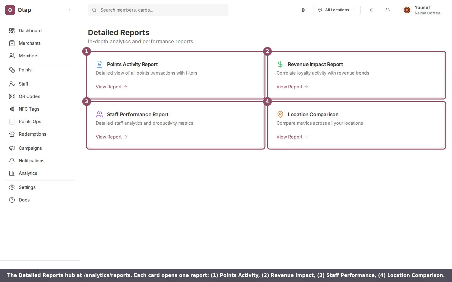
> The Detailed Reports hub and the four reports it opens: points activity, revenue impact, staff performance, and location comparison.
The Detailed Reports hub is where you go past the headline numbers on the Analytics page and read the underlying data. It holds four reports, each on its own page, and links to all of them from one screen.
You won't see a Reports item in the sidebar. Open the hub directly at `dashboard.qtap.qa/analytics/reports`.
 Owners and managers can open the reports. Staff can't by default. To let a staff member in, give them analytics access in their permissions (see [Roles and permissions](/merchants/staff/roles-permissions)).
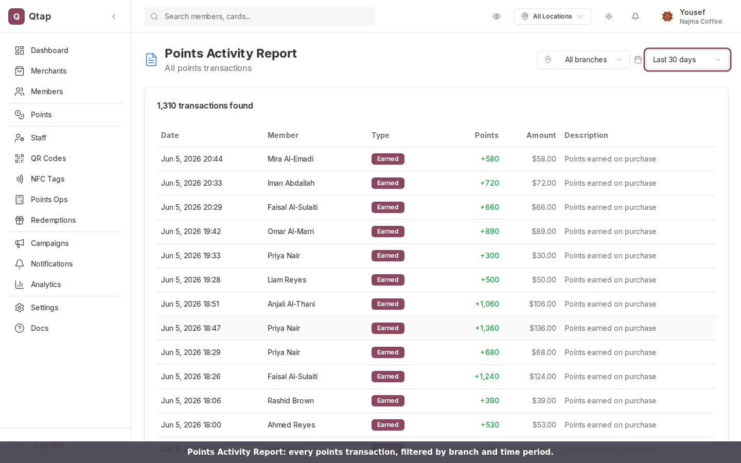
Three of the four reports share two filters at the top right: a **branch** filter to narrow to one location, and a **time period** selector with 7 days, 30 days, 90 days, and 12 months. Change either and the report reloads.
## Points Activity Report
A line-by-line log of every points transaction. Each row shows the date and time, the member, the type, the points, the purchase amount, and a description. The type is one of Earned, Redeemed, Adjusted, or Expired. Long histories page 50 rows at a time.
Owners and managers can open the reports. Staff can't by default. To let a staff member in, give them analytics access in their permissions (see [Roles and permissions](/merchants/staff/roles-permissions)).
Three of the four reports share two filters at the top right: a **branch** filter to narrow to one location, and a **time period** selector with 7 days, 30 days, 90 days, and 12 months. Change either and the report reloads.
## Points Activity Report
A line-by-line log of every points transaction. Each row shows the date and time, the member, the type, the points, the purchase amount, and a description. The type is one of Earned, Redeemed, Adjusted, or Expired. Long histories page 50 rows at a time.
 ## Revenue Impact Report
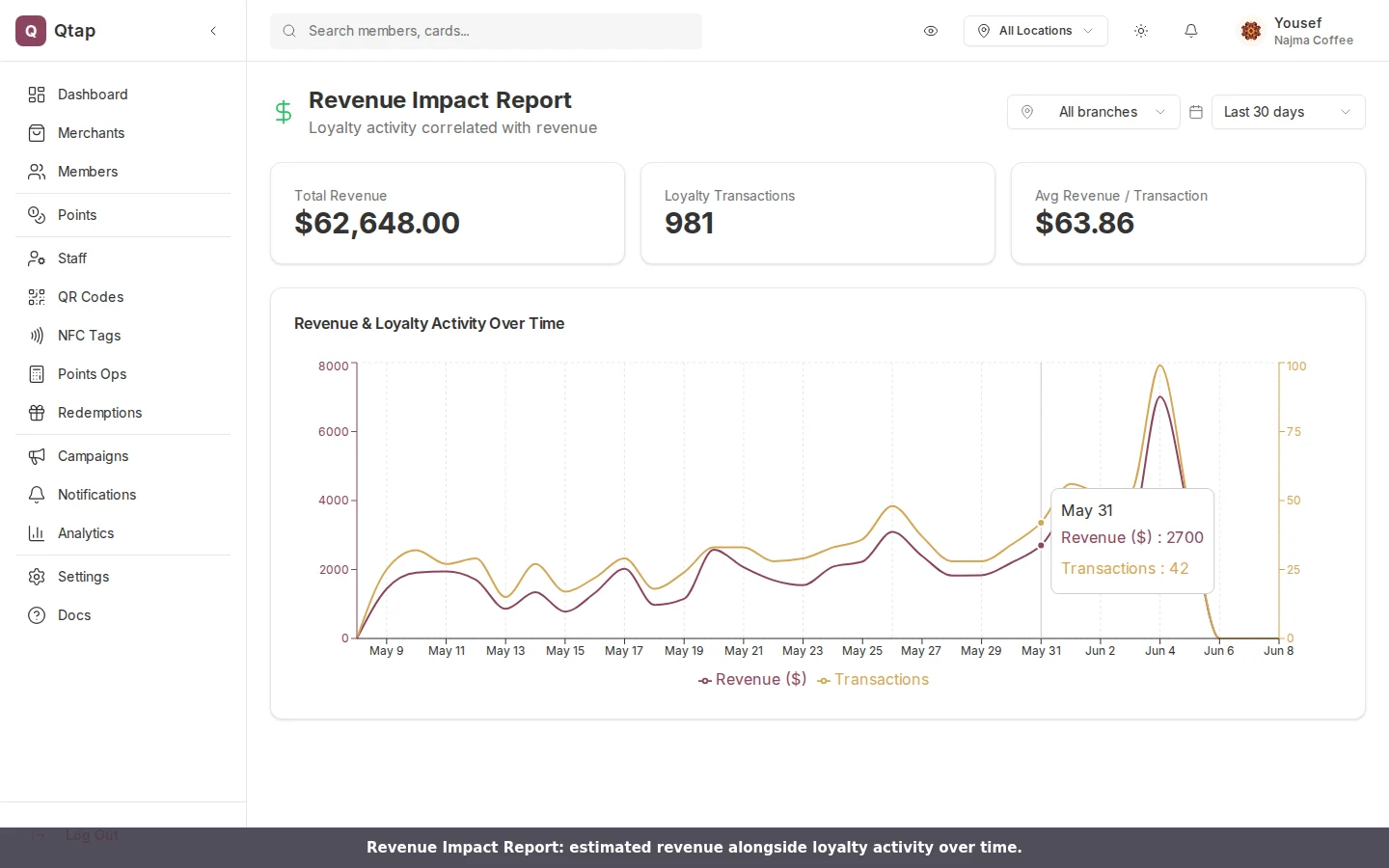
Estimated revenue read against loyalty activity. Three figures sit at the top: total revenue, loyalty transactions, and average revenue per transaction. Below them, a chart plots revenue and transaction count over time on the same axis so you can see them move together.
The revenue figure is an estimate Qtap builds from transaction amounts rather than a feed from your point-of-sale till. Treat it as a trend line and keep your till for the exact books.
## Revenue Impact Report
Estimated revenue read against loyalty activity. Three figures sit at the top: total revenue, loyalty transactions, and average revenue per transaction. Below them, a chart plots revenue and transaction count over time on the same axis so you can see them move together.
The revenue figure is an estimate Qtap builds from transaction amounts rather than a feed from your point-of-sale till. Treat it as a trend line and keep your till for the exact books.
 ## Staff Performance Report
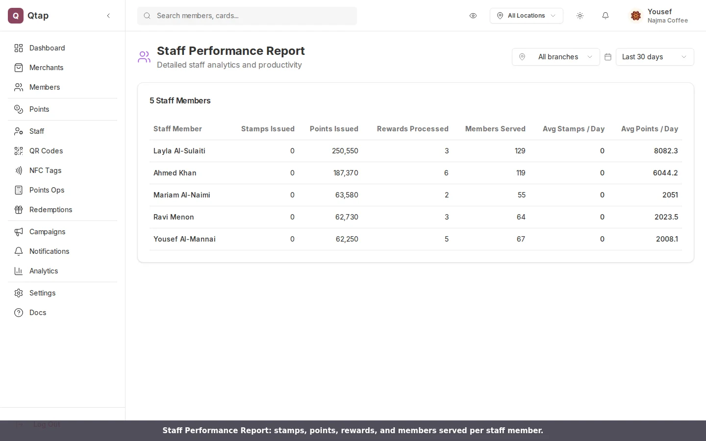
One row per staff member, with stamps issued, points issued, rewards processed, members served, and a daily average for stamps and points. On a points-only program the stamp columns read zero, which is expected. Use this to see who is busy and who needs a hand at the counter.
## Staff Performance Report
One row per staff member, with stamps issued, points issued, rewards processed, members served, and a daily average for stamps and points. On a points-only program the stamp columns read zero, which is expected. Use this to see who is busy and who needs a hand at the counter.
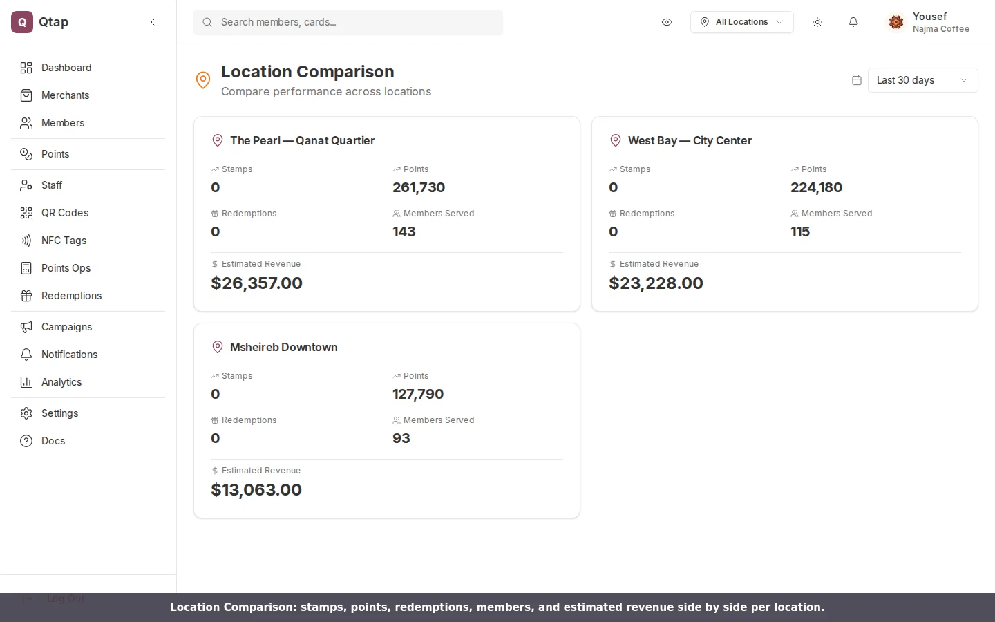
 ## Location Comparison
For merchants with more than one branch, a card per location showing stamps, points, redemptions, members served, and estimated revenue. The cards sit side by side so you can compare a busy branch against a quiet one at a glance. This report has a time period selector but no branch filter, since the point is to see every branch at once.
## Location Comparison
For merchants with more than one branch, a card per location showing stamps, points, redemptions, members served, and estimated revenue. The cards sit side by side so you can compare a busy branch against a quiet one at a glance. This report has a time period selector but no branch filter, since the point is to see every branch at once.
 For the headline metrics, charts, and export tools, start on the [Analytics Overview](/merchants/analytics/overview). The reports here are the detailed view beneath it.