> ## Documentation Index
> Fetch the complete documentation index at: https://docs.qtap.qa/llms.txt
> Use this file to discover all available pages before exploring further.
# The Card Designer
> Style a loyalty card with templates, colors, and icons before you build it in the create-card wizard.
The Card Designer is a sandbox for the look of a loyalty card. You pick a starting
template, change the colors, icon, and layout, and a phone preview updates as you go.
It lives at the `/cards/design` URL. There is no sidebar or Cards-page link to it yet,
so you reach it by typing the address.
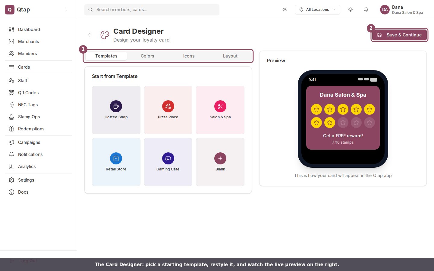 The page splits in two: the design panels on the left, and a live preview of the
member's card on the right. Four tabs sit above the panels.
## Templates
The **Templates** tab opens with a gallery of starter designs: Coffee Shop, Pizza
Place, Salon & Spa, Retail Store, Gaming Cafe, and Blank. Click one and its colors,
icon, stamp count, and layout fill in at once. A template is a starting point, so you
can keep editing after you pick one.
## Colors
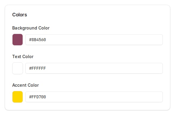
The **Colors** tab sets three colors: **Background**, **Text**, and **Accent** (the
fill on a collected stamp). Each one opens a color picker with eight presets, or you
can type a hex value into the field next to the swatch.
The page splits in two: the design panels on the left, and a live preview of the
member's card on the right. Four tabs sit above the panels.
## Templates
The **Templates** tab opens with a gallery of starter designs: Coffee Shop, Pizza
Place, Salon & Spa, Retail Store, Gaming Cafe, and Blank. Click one and its colors,
icon, stamp count, and layout fill in at once. A template is a starting point, so you
can keep editing after you pick one.
## Colors
The **Colors** tab sets three colors: **Background**, **Text**, and **Accent** (the
fill on a collected stamp). Each one opens a color picker with eight presets, or you
can type a hex value into the field next to the swatch.
 ## Icons
The **Icons** tab is the stamp icon: the shape that fills in each time a member earns
a stamp. Icons are grouped into Food & Drinks, Services, Shopping, Entertainment, and
Symbols. The selected icon shows a maroon outline.
## Layout
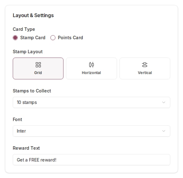
The **Layout** tab holds the card's settings:
* **Card Type**: Stamp Card or Points Card.
* **Stamp Layout**: Grid, Horizontal, or Vertical.
* **Stamps to Collect**: 6, 8, 10, 12, 15, or 20.
* **Font**: Inter, Poppins, Roboto, Open Sans, Montserrat, or Playfair Display.
* **Reward Text**: the line a member reads under the stamps, such as *Get a FREE reward!*
## Icons
The **Icons** tab is the stamp icon: the shape that fills in each time a member earns
a stamp. Icons are grouped into Food & Drinks, Services, Shopping, Entertainment, and
Symbols. The selected icon shows a maroon outline.
## Layout
The **Layout** tab holds the card's settings:
* **Card Type**: Stamp Card or Points Card.
* **Stamp Layout**: Grid, Horizontal, or Vertical.
* **Stamps to Collect**: 6, 8, 10, 12, 15, or 20.
* **Font**: Inter, Poppins, Roboto, Open Sans, Montserrat, or Playfair Display.
* **Reward Text**: the line a member reads under the stamps, such as *Get a FREE reward!*
 ## The live preview
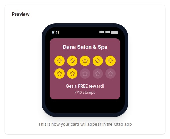
The right side shows a phone with your card on it, using your business name and an
example of 7 collected stamps. Every change you make on the left updates here, so you
can read the card the way a member will before you commit to it.
## The live preview
The right side shows a phone with your card on it, using your business name and an
example of 7 collected stamps. Every change you make on the left updates here, so you
can read the card the way a member will before you commit to it.
 ## Saving your design
The **Save & Continue** button takes you to the create-card wizard at `/cards/new`,
where you finish building the card and publish it.
The design you make here does not carry into the wizard. Save & Continue opens the
new-card wizard, but the wizard starts fresh, so you set the card's colors, icon,
and stamp count again on its **Card Design** step. For now the Card Designer is a
place to try looks and settle on a direction before you build the real card.
For the fields you set when you actually create a card, see [Creating a stamp
card](/merchants/stamp-cards/creating) and [Designing your stamp
card](/merchants/stamp-cards/designing).
## Who can open it
Owners and managers can open the Card Designer. Staff have no access to the Cards area
by default, so they do not see it unless you give them stamp card access.
## Saving your design
The **Save & Continue** button takes you to the create-card wizard at `/cards/new`,
where you finish building the card and publish it.
The design you make here does not carry into the wizard. Save & Continue opens the
new-card wizard, but the wizard starts fresh, so you set the card's colors, icon,
and stamp count again on its **Card Design** step. For now the Card Designer is a
place to try looks and settle on a direction before you build the real card.
For the fields you set when you actually create a card, see [Creating a stamp
card](/merchants/stamp-cards/creating) and [Designing your stamp
card](/merchants/stamp-cards/designing).
## Who can open it
Owners and managers can open the Card Designer. Staff have no access to the Cards area
by default, so they do not see it unless you give them stamp card access.