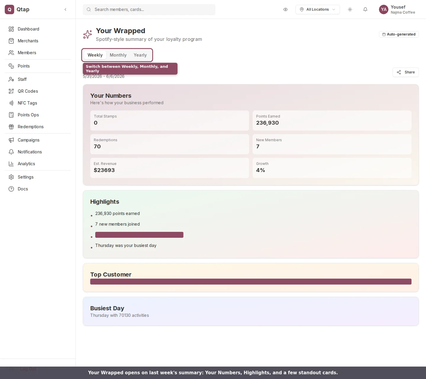
Your Wrapped opens on last week's summary, with Your Numbers, Highlights, and a few standout cards.
Choosing a period
Three tabs sit under the title: Weekly, Monthly, and Yearly. Each tab shows the last full period that has finished:- Weekly covers the previous week, Sunday through Saturday.
- Monthly covers the previous calendar month.
- Yearly covers the previous calendar year.
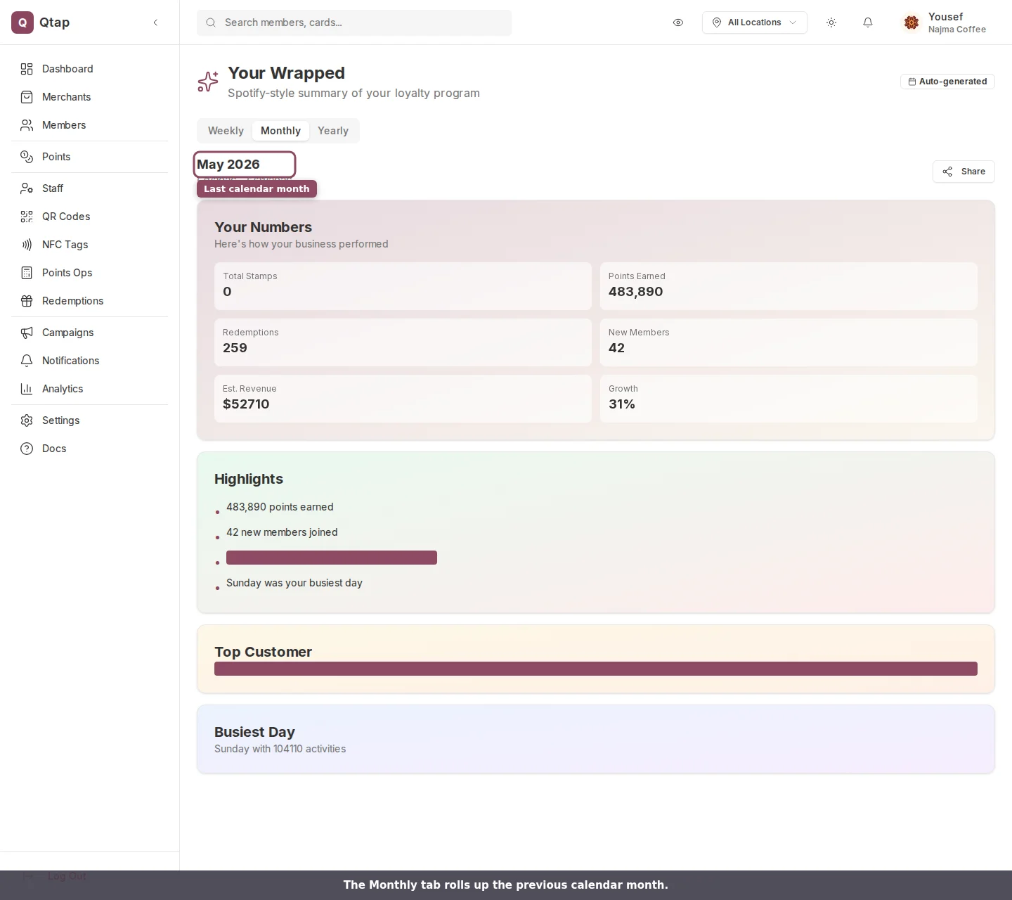
The Monthly tab rolls up the previous calendar month.
Your Numbers
The first card sums up the period in six figures:- Total Stamps issued across your stamp cards.
- Points Earned by your members.
- Redemptions, the rewards your members claimed.
- New Members who joined during the period.
- Est. Revenue, an estimate based on the activity in the period.
- Growth, new members measured against the members you already had, shown as a percentage.
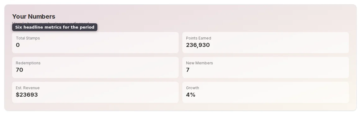
The six headline metrics in Your Numbers.
Highlights and standout cards
Below the numbers, Highlights lists a few plain-language lines drawn from the same data: how many points members earned, how many new members joined, who your most active customer was, and which weekday was busiest. Only the lines with real activity show up. Two more cards round out the recap when there’s data for them. Top Customer names the member who visited most and how many times they came in. Busiest Day names the weekday with the most activity. To send the recap on, use Share at the top right.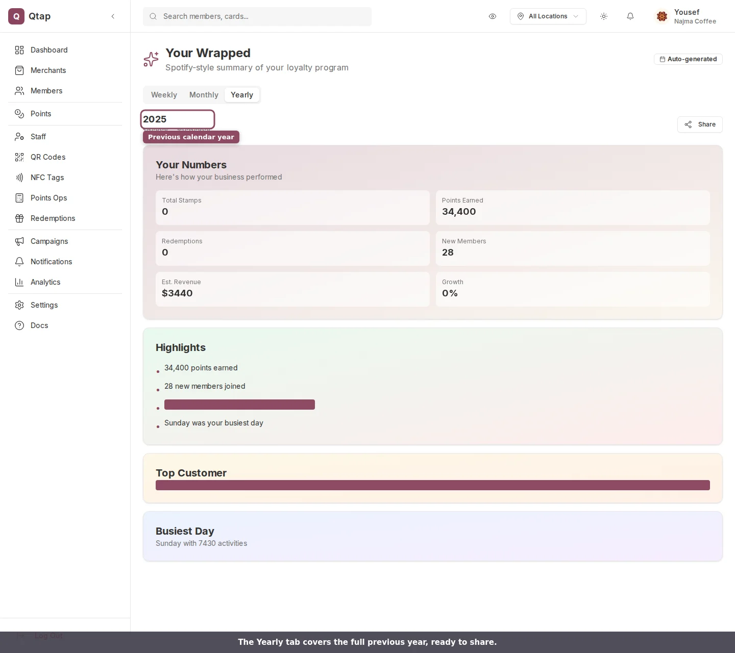
The Yearly tab covers the full previous year.
If a period looks empty
A quiet week or a brand-new account can leave a period with nothing to show. When that happens, the tab reads “No data available for this period yet.” Switch to a longer period, or check back once you’ve had a few scans and redemptions.Your Wrapped is part of the Growth plan and up. On the Starter plan, the page shows a prompt to move to a plan that includes it.
Owners and managers can open Your Wrapped. Staff members don’t see the Analytics area by default, so they can’t reach it unless you give them analytics access.
Analytics Overview
The full analytics page with metrics, charts, and exports.
Revenue Impact
A closer look at the revenue your program brings in.