Front Card
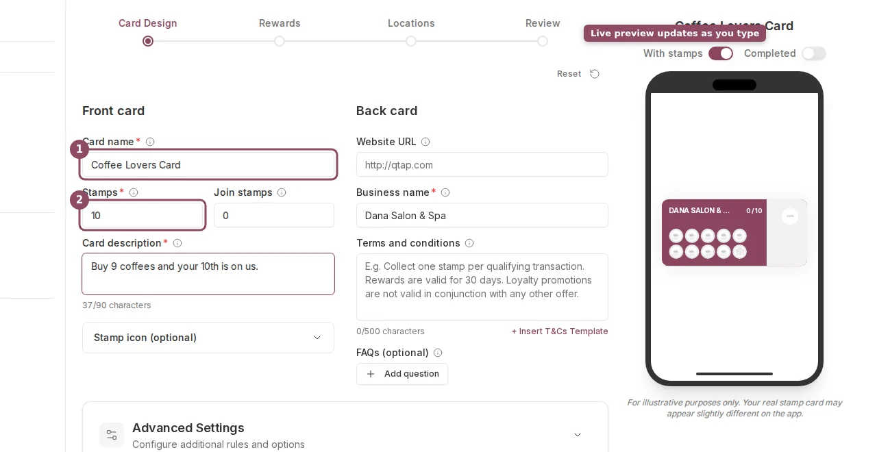
Card name is required. This is what members see on their stamp card. Keep it short and specific to the card’s purpose, like “Coffee Card” or “Summer Loyalty Card.” Stamps is the stamp goal, meaning how many stamps a member needs to collect before they earn the Main reward. The minimum is 1 and the maximum is 20. Defaults to 10. Join stamps gives new members a head start when they first join the card. Set to 0 for no bonus. The maximum is 10. This is the same as the Welcome Bonus in Advanced Settings. Card description appears on the front of the card in the member app. Use it to tell members what they’re working toward, for example “Buy 6 coffees, get 1 free!” The limit is 90 characters. Stamp icon is the emoji or image displayed inside each stamp space. Click the Stamp icon (optional) section to expand it. Pick from the built-in options (coffee cup, star, heart, target, diamond, and food icons) or upload a custom PNG or SVG file up to 500KB. The selected icon also appears as the card’s identity icon on the front.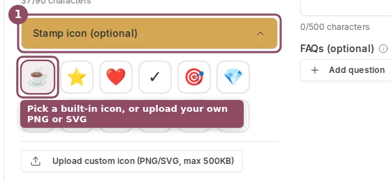
Back Card
Website URL appears as a link on the back of the card in the member app. This field is optional. Business name is shown on the card. It pre-fills with your organization name. You can change it per card if you operate multiple brands. Terms and conditions is optional text shown on the back of the card. You can type your own or click + Insert T&Cs Template to fill in a standard template. The limit is 500 characters.Card Color
The card color is the background color of the stamp card. Click the color swatch next to the Card name field to open a color picker. You can enter a hex code directly if you have a specific brand color.Advanced Settings
Advanced Settings is a collapsible section below the main form on the Card Design step. Click it to expand.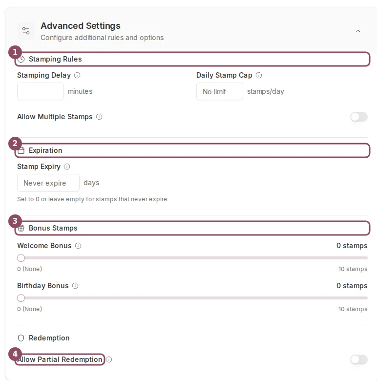
- Stamping Delay — minimum number of minutes that must pass between stamps for the same customer. Set this to prevent customers from being stamped multiple times in the same visit. Leave at 0 for no delay.
- Daily Stamp Cap — maximum stamps a customer can earn in one day. Leave empty for no limit.
- Allow Multiple Stamps — when on, staff can issue more than one stamp per transaction (for example, one stamp per item purchased).
- Stamp Expiry — number of days after which stamps expire if the customer is inactive. Leave empty for stamps that never expire.
- Welcome Bonus — stamps given when a customer first joins the card. Adjustable from 0 to 10 using a slider. This is the same as the Join stamps field at the top of the form.
- Birthday Bonus — extra stamps given on a customer’s birthday. Adjustable from 0 to 10. Requires the customer to have a birthday saved in their member profile.
- Allow Partial Redemption — when on, customers can redeem milestone (Interim) rewards before they complete the full stamp card.
Creating a Stamp Card
Full walkthrough of all four steps in the stamp card wizard.
Stamp Card Rewards
How to configure Main, Sign Up, and Interim rewards.