

dashboard.qtap.qa/analytics/reports/location-comparison, or open the hub and click the Location Comparison card.
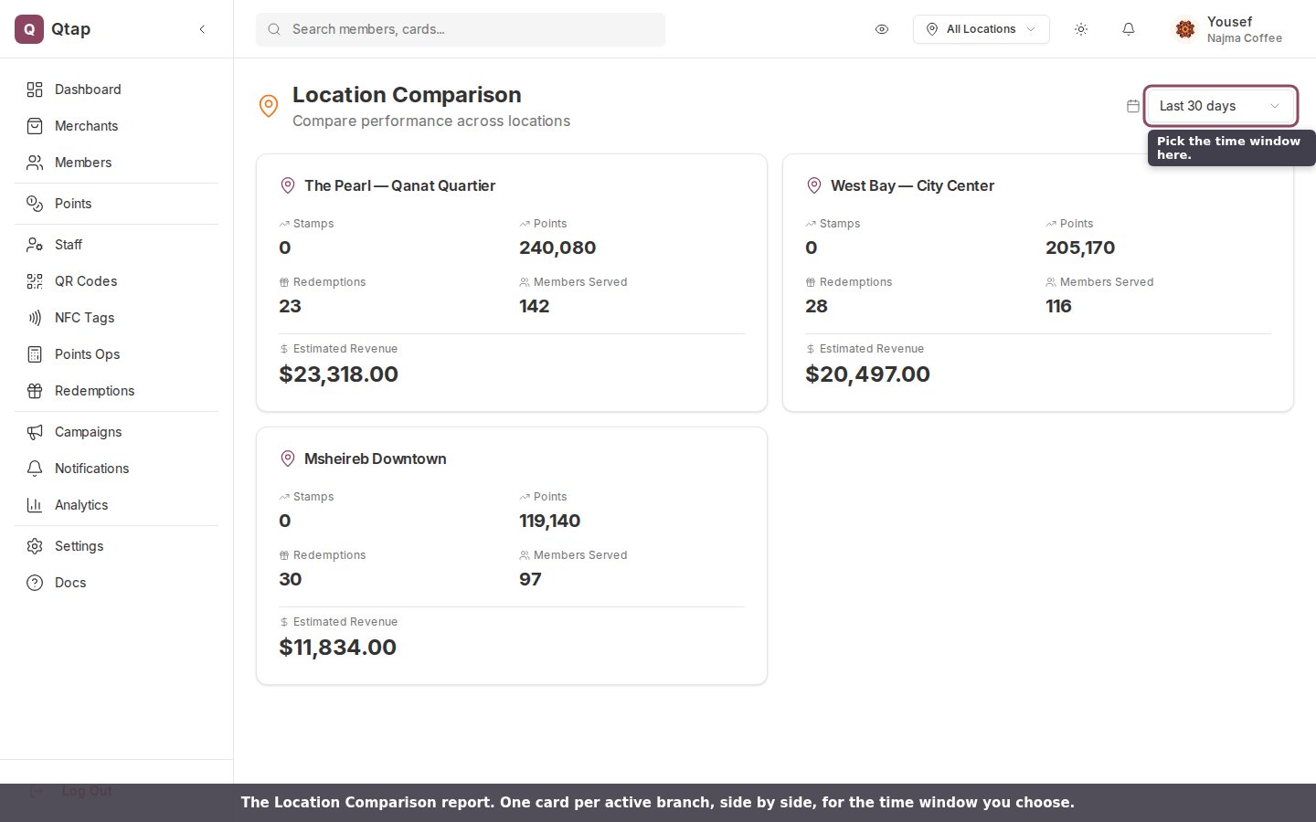
The Location Comparison report. One card per active branch, side by side, for the time window you choose.
What each card shows
Every card carries the same five figures for the branch named at the top, counted over the period you pick. Only transactions that were recorded against that branch are included.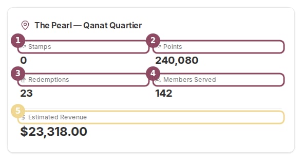
One branch card. The same five figures appear for every location.
- Stamps is the total number of stamps issued at that branch.
- Points is the total number of points earned there.
- Redemptions is how many rewards were redeemed at that branch.
- Members Served is how many different members had any activity there. A regular who came in ten times still counts once.
- Estimated Revenue adds up the purchase amounts behind the points your members earned at that branch.
Estimated Revenue is worked out from the spend your staff enter when they award points, not from a cash register. Treat it as a guide to which branch is busier, not as an exact sales total.
Pick a time window
The time period selector covers Today, Last 7 days, Last 30 days, Last 90 days, and This year. It opens on Last 30 days. Change it and every card reloads for the new window at once, so the branches always cover the same dates.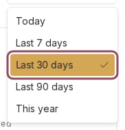
The time period selector. The report opens on the last 30 days.
Who can see it
Owners and managers can open the report. Staff can’t by default, because analytics access is off for the staff role. To let a team member in, turn on their analytics permission (see Roles and permissions).Detailed Reports
The hub that opens this report and three others.
Revenue Impact
How loyalty activity tracks against estimated revenue across the whole business.