

Opening the menu
Below roughly 768 pixels the left sidebar is replaced by a menu button in the top-left corner. Tap it and the navigation slides in from the left with the same items you see on a desktop, filtered to what your role can open. Tap a page and the menu closes itself, so there is no separate close step to remember.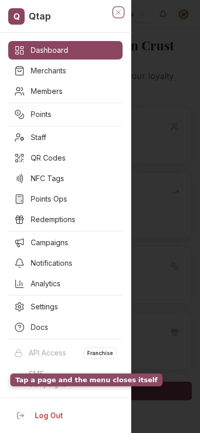
The navigation slides in from the left when you tap the menu button.
The Members list on a phone
On a wide screen the members table has a column each for contact details, stamps, points balance, join date, last activity and push status. None of that fits across a phone, so those columns fold into a labelled list under the customer’s name rather than disappearing. Below 640 pixels the email, phone, stamps, points and push lines all sit in that list. Between 640 and 1024 they go back to being columns, and only Joined and Last active stay in the list. From 1024 up you get the full table. No figure is lost at any width. Anything that has a column on a desktop is printed under the name on a phone.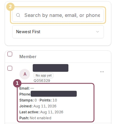
Contact details, balances and push status fold into a labelled list under each customer's name.
The QR Codes page on a phone
QR Codes folds the same way, in three stages. The code and type drop into the list below 640 pixels, the action and scan count below 768, and the branch and created date below 1024. The status badge moves too. On a desktop it has its own column; on a phone it sits beside the code’s name, so you can still tell an expired code from a working one at a glance. Two other things change on this page. The five filter dropdowns collapse behind a single Filters button, which carries a count of how many filters you have set, and the search box gets a row to itself instead of sharing one with the view toggle. The three figures at the top shorten their labels to Total, Active and Scans.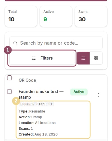
The Filters button (1) replaces the filter row, and each code's details fold into a labelled list (2).
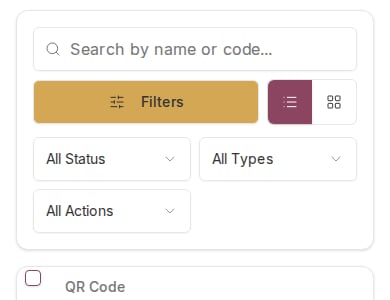
Tapping Filters opens the dropdowns below the search box.
What still wants a wider screen
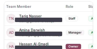
The Staff table keeps its columns at phone width, so the right-hand ones sit past the edge.
Nothing on screen warns you that you are on a small display. If a page looks cramped, that is the layout doing its best with the width it has, not an error.