/cards/design URL. There is no sidebar or Cards-page link to it yet,
so you reach it by typing the address.
Templates
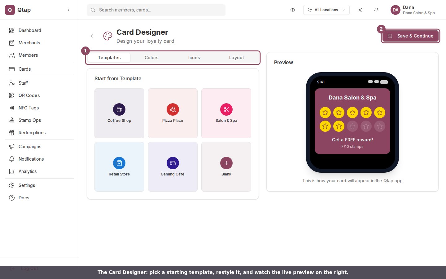
The Templates tab opens with a gallery of starter designs: Coffee Shop, Pizza Place, Salon & Spa, Retail Store, Gaming Cafe, and Blank. Click one and its colors, icon, stamp count, and layout fill in at once. A template is a starting point, so you can keep editing after you pick one.Colors
The Colors tab sets three colors: Background, Text, and Accent (the fill on a collected stamp). Each one opens a color picker with eight presets, or you can type a hex value into the field next to the swatch.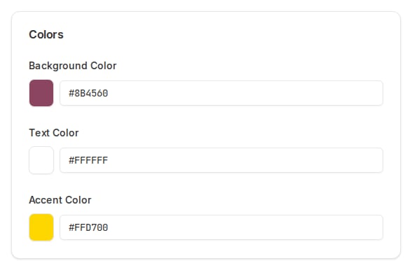
Icons
The Icons tab is the stamp icon: the shape that fills in each time a member earns a stamp. Icons are grouped into Food & Drinks, Services, Shopping, Entertainment, and Symbols. The selected icon shows a maroon outline.Layout
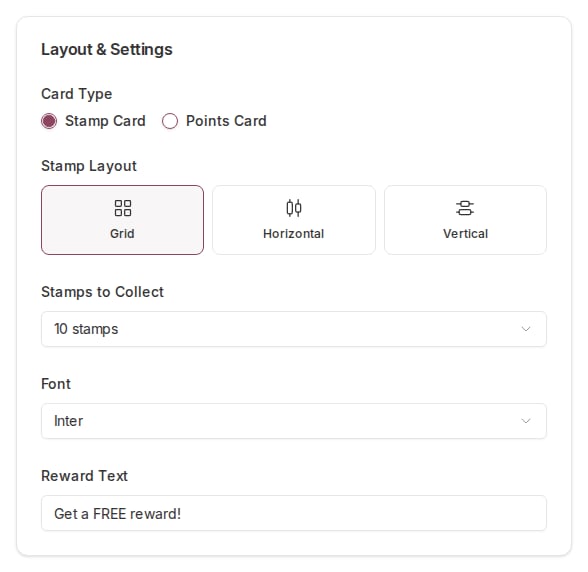
The Layout tab holds the card’s settings:- Card Type: Stamp Card or Points Card.
- Stamp Layout: Grid, Horizontal, or Vertical.
- Stamps to Collect: 6, 8, 10, 12, 15, or 20.
- Font: Inter, Poppins, Roboto, Open Sans, Montserrat, or Playfair Display.
- Reward Text: the line a member reads under the stamps, such as Get a FREE reward!
The live preview
The right side shows a phone with your card on it, using your business name and an example of 7 collected stamps. Every change you make on the left updates here, so you can read the card the way a member will before you commit to it.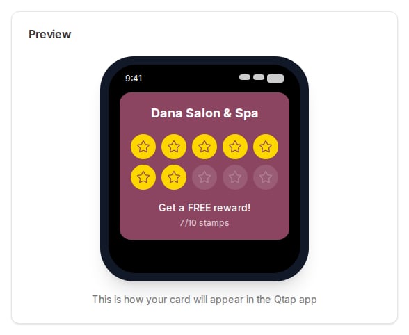
Saving your design
The Save & Continue button takes you to the create-card wizard at/cards/new,
where you finish building the card and publish it.
The design you make here does not carry into the wizard. Save & Continue opens the
new-card wizard, but the wizard starts fresh, so you set the card’s colors, icon,
and stamp count again on its Card Design step. For now the Card Designer is a
place to try looks and settle on a direction before you build the real card.